

In this article, you’ll learn:
- Why coffee can design sets expectations before anyone tastes the coffee
- What to weigh in coffee can design beyond the visuals
- How coffee can design shapes the sensory experience, and how to get it right
Research and studies on consumer buying decisions, have all identified packaging design as a factor consumers rely on heavily to judge a product. The coffee industry is no different.
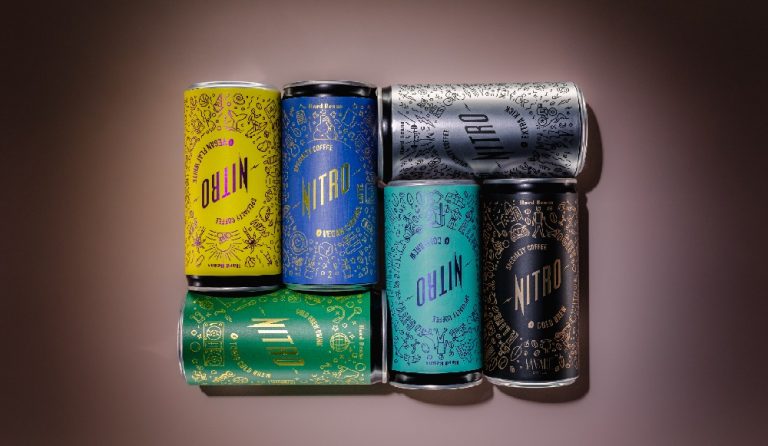
Many businesses find cans more ideal for storing RTD coffee products, primarily because they are lighter, exceptionally durable, food-safe, and highly recyclable and customisable. But on crowded shelves, packaging becomes one of the most important ways for a brand to differentiate its product.
Some designs stand out, while others struggle to communicate what makes the coffee distinctive. Duncan Lim has experienced it all. He is a coffee championship coach, a World Brewers Cup-certified judge, and the founder of Madness Roastworks, a specialty coffee roastery in Kota Kinabalu, Sabah, Malaysia. Read on for his insights on what makes coffee can design work.

Why does coffee can design matter before the coffee is even opened?
Coffee can design matters first because it sets an expectation of quality before anyone smells or tastes what is inside.
Packaging is perhaps the clearest illustration of why first impressions matter. A can has about three seconds to convince a shopper. If it succeeds, the experience then has to meet those expectations, and ideally exceed them, to build a connection.
As Duncan explains, “The can is often the first sensory touchpoint.” That first interaction shapes how a shopper judges quality. “Before someone smells or tastes the coffee, they have already formed an expectation based on the packaging,” he adds.
To win a customer’s attention, a brand has to weigh every design element: shape, colour, imagery, typography, and closure mechanism. Past and recent studies have found that each one carries significant influence on consumer behaviour and preferences.
Duncan shares an overall approach that works, based on his experience. “If the design looks premium, minimal and carefully considered, people will often expect the coffee to be more refined,” he explains. “If it looks highly commercial or mass-market, they may approach it with a completely different expectation.”
Every element deserves that scrutiny. History is littered with packaging designs that failed, not for lack of good looks, but for getting one thing wrong.
Duncan has one more tip on coffee can design. Shoppers should never work hard to figure out who you are and what you offer. Better still, your coffee can design should slow them down and invite them to touch and explore it.
“Good packaging should create curiosity without misleading the consumer,” he explains. “It should communicate, ‘There is something worth discovering here.'”
What should a brand consider in coffee can design beyond the visuals?
Beyond visuals, a brand should weigh format, material, printing, information hierarchy, hand feel, shelf presence, and how the can photographs.
Researchers at MIT found that the brain can process an image in as little as 13 milliseconds. To put that into perspective, it is roughly 30 times faster than the blink of an eye. NYU scientists who ran a similar study on text found that the brain grasped it in about 150 milliseconds.
Consumers register the visual elements and text on your can in about the blink of an eye. How they react to what they see matters just as much, which is why Duncan insists on functional features too.
“You need to think about the entire experience,” he advises. “The format, material, printing, colour, typography, information hierarchy, how it feels in the hand, how it looks on a shelf, and even how it photographs for social media.”
That means approaching coffee can packaging design from the final consumer experience. Build backwards from what shoppers should see on social media, e-commerce, and physical shelves. Add what you want them to feel the first time they pick it up.
Go the extra mile to determine what shoppers should understand as they keep handling your canned coffee packaging. Market research comes first, so you understand their needs and expectations, and your coffee can branding follows from that.
“The packaging needs to communicate what the coffee actually is,” Duncan explains. “Is it a premium single-origin coffee? Is it approachable and everyday? Is it experimental? Is it designed for coffee enthusiasts or for a much broader audience?”
According to him, “The design should make that positioning immediately understandable.” Leaving coffee can packaging design until late in product development is risky. It drives up costs and hurts the user experience.
That has been Duncan’s approach from the outset. “I would always treat the can as part of the product development process, rather than something you design after the coffee is already finished.”

How does coffee can design affect the sensory experience?
Design affects taste perception, because colour, texture, and visual cues shape what drinkers expect and then notice in the cup.
The visual elements on your can and the material it is made of both shape sensory expectations. “Packaging can influence how well the product protects its flavour and aroma over its shelf life,” Duncan points out.
Sensory receptors, particularly touch and sight, shape perceived flavour by relying on packaging elements such as texture, colour, and visual cues. Duncan has the perfect example to illustrate that.
“If the packaging communicates a delicate, high quality specialty coffee, consumers may pay more attention to acidity, sweetness, aroma and texture.” Research on specialty coffee packaging backs this up: colour alone can shift how people perceive flavour.
This is why it can be valuable to involve professionals who understand both packaging design and the sensory experience of coffee. “A designer understands visual communication and brand identity,” Duncan says. “A coffee professional understands the product and sensory experience. A co-packer understands the practical realities of production, filling, sealing, shelf life and what is actually possible at scale.”
Bringing these perspectives together early can help identify design and production issues before they become costly to fix.. He also flags a common mistake. “The strongest packaging usually has a very clear hierarchy,” he says. “You should be able to understand the product from a distance, then discover more information as you get closer.”
Positioning has to match that hierarchy, and Duncan explains what goes wrong when it does not. “If the coffee is positioned as a high end specialty product but the packaging feels generic, the consumer may never understand why the coffee deserves its premium price.”
Because of the risks that come with leaving coffee can branding late in product development, it should never be an afterthought. This is perhaps why Duncan says he would “rather have the coffee, brand, design and production teams communicate from the beginning.”
Coffee can packaging design is a core part of branding, so it should stay consistent with the wider brand strategy. The story it tells needs to hold up across every platform, and product quality has to back it up. According to Duncan, “When those three things align, the can becomes much more than packaging, it becomes part of the coffee experience.”
Hardtank’s private label services bring formulation and RTD production together, helping brands move from product concept to a market-ready canned coffee. Those services include market-ready and custom formulas, so brands launch RTD coffees quickly without heavy investment.
Coffee can design: Key takeaways
- A can gets about three seconds on the shelf, so the design has to say what the coffee is at a glance.
- Design runs deeper than looks, because material, hierarchy, hand feel, and how the can photographs all shape the buy.
- Bring the designer, the coffee professional, and the co-packer in early, since late design work costs money and credibility.
Ready to get your coffee can design right the first time? Explore Hardtank’s private label process and market-ready recipes, or schedule a free consultation.
Coffee can design: FAQ
Why does coffee can design matter so much?
A can has roughly three seconds to convince a shopper, and that first look sets the expectation for the coffee. Design elements such as shape, colour, imagery, typography, and closure all feed that judgement.
When should coffee can design start?
At the start of product development, not after the coffee is finished. Duncan Lim treats the can as part of the product itself, because late design work drives up costs and weakens the consumer experience.
Who should be involved in designing a coffee can?
A designer, a coffee professional, and a co-packer. The designer handles visual communication and brand identity, the coffee professional owns the sensory side, and the co-packer knows what production, filling, sealing, and shelf life allow.
Want to launch your own canned coffee?
- Explore private label: see how the Hardtank process works.
- Launch faster: browse market-ready recipes.
- Speak to the team: schedule a free consultation.